
Assignment 1 - April 12
4 posters
Page 1 of 1

Assignment 1 - April 12
![]() Admin Mon Apr 12, 2010 7:37 am
Admin Mon Apr 12, 2010 7:37 am
This is more or less an assessment drawing to help me learn who you are as an artist by evaluating your interests and skill level.
Assignment for April
Draw what you're interested in, or what you feel you're best at drawing. Sometimes, what artists enjoy drawing doesn't necessarily present their skills the best, so think about what you'd like to choose and as yourself, "Will this show my abilities or limit how much I can show?" For instance, it wouldn't be ideal for someone who is good with color to not include color.
Examples include:
still life
figure studies
character studies
environmental/landscapes
portraits
animals
colors
paint
graphite pencil
Feel free to post your questions, problems, or ideas if you'd like to discuss them. Get done what you can by next Sunday, the 18th, and post your drawings here. If you need more time, just let me know.
Otherwise, have a good week!
Admin- Admin
- Posts : 12
Join date : 2010-04-08 -

The souls mirror
![]() Inkmoon Sun Apr 18, 2010 5:43 am
Inkmoon Sun Apr 18, 2010 5:43 am
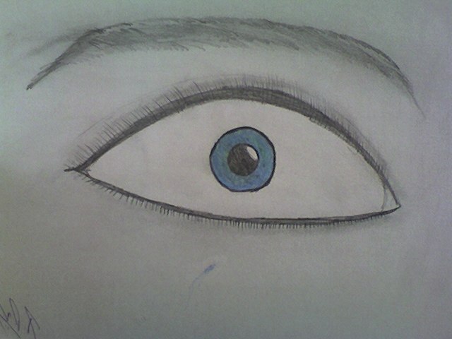
Ok here is the first assignment, I thought that drawing eyes shows my personality. I really like eyes I dunno why. I think its the mirror to the soul. I think I know how to upload the drawing now... I hope... Sooooo whaddya think???
https://i.servimg.com/u/f61/15/11/85/29/snapsh12.jpg[/img]
Did it work???
https://i.servimg.com/u/f61/15/11/85/29/snapsh12.jpg[/img]
Did it work???
Inkmoon- Posts : 7
Join date : 2010-04-13
First assignment.
![]() JinxedTarotCard Sun Apr 18, 2010 2:51 pm
JinxedTarotCard Sun Apr 18, 2010 2:51 pm
Made this for my grandmother. I love coming up with hairstyles and wanted to use color since I've been doing nothing but charcoal drawings lately. I also like coming up with clothing, but my anatomy isn't so good, so I stuck to just drawing a head. Did I mention love color? XD

JinxedTarotCard- Posts : 5
Join date : 2010-04-08
Age : 34 -
Assignment One
![]() Chocobochaos Mon Apr 19, 2010 6:34 pm
Chocobochaos Mon Apr 19, 2010 6:34 pm
Ok, so this is my latest piece. I figured it would show my highest potential, since well, it was worked on much more intently than my usual pieces. My strong points, as I see them, have been anatomy of large forms, color, digital medias, and my own style which is a hybrid of anime/ameramanga/ and cartooning.
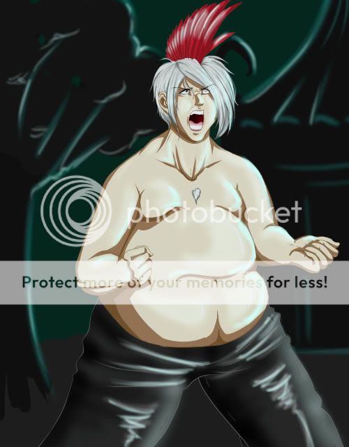
I'm including the reference below, to give a better insight on my anatomy and how it stands at this time...
https://2img.net/h/i64.photobucket.com/albums/h176/RathNythum/roar.jpg
I know for a fact that this does not show all of my strongest points, but I feel that it shows the 'cleanest and most detailed' strong points of mine- Vectoring being the biggest part of that for me, digital arts programs being a large second.
*Piece was done 100% in Paint Tool Sai.
::::: -- ::::::
It is also made up in a large size on my Devi: http://chocobochaos.deviantart.com/art/Nanashi-s-Siren-Attack-161240522
Chocobochaos- Posts : 3
Join date : 2010-04-15
Critique 1 and 2
![]() Admin Mon Apr 19, 2010 7:44 pm
Admin Mon Apr 19, 2010 7:44 pm
Thank you all for doing a fantastic job. Hopefully your week isn't as stressful as mine. =P Once school lets out in a couple weeks, I'll be able to do more with you guys. I'll also be getting a tablet sometime, so I'll be able to give visuals and demos for you, which should be extremely helpful.
All three of you are on different levels of skill, considering your age or amount of training. I don't want anyone to feel overwhelmed or that they are expected of more that they can give. The goal is to learn not only from me, but from each other.
I'll start the critique chronologically.
Inkmoon.
Eyes are a very common thing to see in the art world, because so many people love drawing them for the same reason you do. It's natural for humans to be attracted to other faces, especially eyes, because that is our sense of visual attention; When people look at you, they are giving you their attention. So, it's important to understand that psychology behind including eyes in a drawing.
That being said, it might not be the best thing to draw an eye that stretches across the page. It gets a bit overwhelming, especially given the intensity of your particular eye. The iris and pupil are much smaller than what can be possible on a human being, but by doing so, you make the eye look shocked or terrified. It's good to know how to manipulate and show emotion through eyes, but try not to exaggerate it.
Did you use a reference? Sometimes the best way to see what something looks like is to sit there, stare at it, and study it. I want you to try drawing another eye. Maybe try adding two in the page. But try your best to look at the size of the iris compared to the eye, the shape of the eye, and the way the eyelashes curl around instead of sticking out. Try finding a mirror, look at your eye for a few minutes, draw a little, look at your eye more. When you're finished, post it in the Critique section of the forum so we can all look at it there.
A wise teacher once told me that the best artists look more than they draw.
Jinxed
Your anatomy is off, yes, but your hair is very inventive. The jawline is a very odd shape and sticks out too much, as if her jaw was a mask that's peeling off. The separate elements of the face are alright, the lips being the worst and the ear being the best. I'm glad you put the lines and detail into the ear. The lobe area might be too big.
Your colors have qualities that I'd like to address. There are certain color schemes that you might have heard of. These color schemes can be manipulated, but usually when you want something to look cohesive and good as a whole, and do it easily, you pick a color scheme. The colors in the necklace and earring are what is called a Triad. On the color wheel, you make an equilateral triangle. The colors on the points create a Triad; in this case, they are purple, orange, and green. These are also secondary colors, because they are all mixed by using two primaries. You background has some purple, orange, and red involved, which makes a sort of Analogous color scheme, which means that the colors are next to each other on the color wheel. A perfect analogous color scheme in this case would include red, red-violet, and violet, but normally people accept it as analogous if it's kind of in the ballpark, like in your case.
Same question to you: Did you use a reference? Using a picture, but not copying it, would help with the anatomy issues. You can use a photo as kind of a map, to know where things go in relation to other things. I'd like you to try another head, but this time, look for photos of heads that you might want to use, or even a mirror of your own. Make sure to add your own things to it and use it as a reference rather than copy it. When you're finished, go ahead and post it in the Critique forum.
Good work you two. Looking at your drawings, is there anything you would have done differently?
(I'll get to yours soon, Choco; Been busy =[ )
Admin- Admin
- Posts : 12
Join date : 2010-04-08 -
Re: Assignment 1 - April 12
![]() JinxedTarotCard Tue Apr 20, 2010 5:33 pm
JinxedTarotCard Tue Apr 20, 2010 5:33 pm
Thanks for the tips! I went back and changed the things you mentioned in the picture and a few other things. It's not a very big change, though. Should I post it up?
I used a reference for the ear and have spent a bit of time practicing eyes. My eyes still come out looking stylized, though. The braids are what I would want to do differently, I like the pattern, but they don't match the heads shape very well. I need to plan them out better next time. Her right eye also bothers me slightly as well as the fact that they're both missing highlights. @_@
I've never taken any classes about color theory or anything, so thank you for telling me about that! I think I might just have a natural color sense or something. XD
JinxedTarotCard- Posts : 5
Join date : 2010-04-08
Age : 34 -
Critique 3
![]() Admin Tue Apr 20, 2010 7:41 pm
Admin Tue Apr 20, 2010 7:41 pm
Nah, don't post it up. Just remember that a drawing isn't finished until you say it is. If you want, you can do another separate drawing of the same subject, using a reference, and post it up in the critiques forum.
Usually most people know what colors look well together. What they don't know, is that every color can work with every other color; you just have to know how to use them. They may be ugly together one way, but if you change the values, intensity, and arrangement, making one dominant and some recessive, you can manipulate even the ugliest colors into looking like a beautiful image.
Choco
Your image shows a good deal of emotion, as well as a good sense of anatomy. There are some major compositional issues I'd like to address that, if fixed, could make the image work much better.
I'm glad you used a reference. You used it well, taking parts that you needed and manipulating the rest. You do have a very clean technique, though keep in mind that "clean" can also mean "tight" when it comes to drawing, which sometimes hinders the artist's ability to capture form. Here, I believe that's what happened, and your figure seems flat. It helps that you added a background, even if vague, because it gives some sense of space.
The forearms are foreshortened well. Yet his upper right arm seems a bit too long. It may be that it's too thin in comparison to the rest of the figure, which makes it seem long. Or it could be that the shoulder is dropped too far down. The neck and collarbone area looks very strained and muscular, which is good for emphasizing his stressed muscles, but looks a bit out of place, as if from the shoulders and up the head belongs to a much thinner guy. The highlights on his pants are too bright as well. Usually you don't want to have that white of a highlight on darker clothing, unless it's very shiny, like metal. The whiteness in both the pants and his body makes him look a bit like he's wrapped in plastic wrap. If you want to make highlights that bright without making the figure look shiny, it would help to soften the graduating values and blend them more.
Compositionally, you have quite a few tangents. A tangent is when two objects are so close to each other, but not touching. This, psychologically, becomes an area of stress, thus becoming a distracting. His hair and left hand are both too close to the edge of the frame. If you were to move the frame over the right, putting the figure in the left side of the image into the Rule of Thirds would solve this issue by adding more space between those pieces and the edge of the image. Having the figure, or focal point, directly in the middle tends to be boring. By following the rule of thirds, you make it more dynamic. In this case, it would also show a bit more of the background without the figure in front, which would give the impression of more space and dimension.
Hope that helps. I tore it apart, but hopefully not in a negative way. =P
Admin- Admin
- Posts : 12
Join date : 2010-04-08 -
Re: Assignment 1 - April 12
![]() Chocobochaos Tue Apr 20, 2010 9:25 pm
Chocobochaos Tue Apr 20, 2010 9:25 pm
Thank you, actually I agree with that full-heartedly. Before I had finished, I had made a mental note to move the image over, to make it not a center-point, but I seemed to have forgotten once I finished the background. The concepts you brought up I understand, the wording may be different, but I do agree with you 100%, and no, I don't feel in any way that you've been negative. ^____^ Just very, very helpful. Thank you.
Chocobochaos- Posts : 3
Join date : 2010-04-15
Thanks
![]() Inkmoon Wed Apr 21, 2010 1:23 pm
Inkmoon Wed Apr 21, 2010 1:23 pm
Thanks for the help! I guess I just need to go into the details...
I will keep trying!!!
I will keep trying!!!
Inkmoon- Posts : 7
Join date : 2010-04-13
Page 1 of 1
Permissions in this forum:
You cannot reply to topics in this forum|
|
|